

Project Objectives
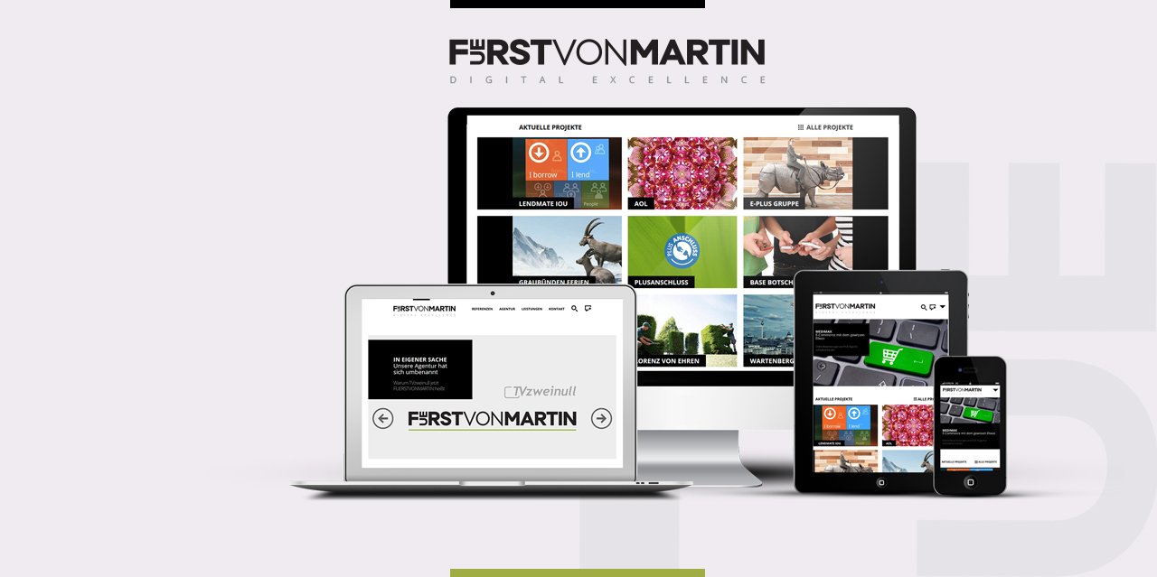
The web is becoming more mobile, more and more users are going online away from desktop PCs and large monitors. The logical consequence: Websites such as the new one from FUERSTVONMARTIN have to present their content impressively both visually and content-wise – on virtually all devices and monitors – especially on smartphones and tablets. We have implemented this goal excellently with the new FVM website.
Responsive design: The right answer for every device
The different sizes of the devices, the different screen resolutions and formats and also the different input options require new technology to present the content optimally. Responsive design reacts to the presentation requirements of every device with the suitable delivery of the content.
Chameleon in web design
The technology behind the responsive design is the so-called Media Queries. This is a CSS3-concept which enables allows the delivery of different website designs independently of the features used by the device used by the user.
